It’s a certain fact that I love paint and the transformation it can bring to different pieces. Lowe’s challenge for me this month was to use Pantone’s 2013 color of the year. That’s an easy one, right? Pantone’s selection can dictate color palettes in fashion and design for the year. Lowe’s sells an exclusive line of Pantone paint, and you can get this year’s emerald green in Valspar’s signature line. 
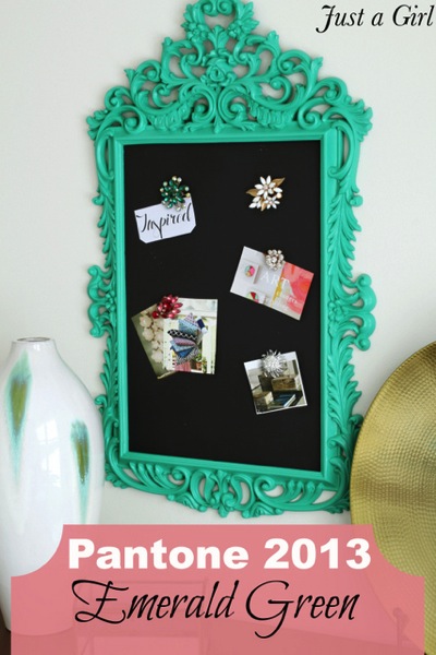
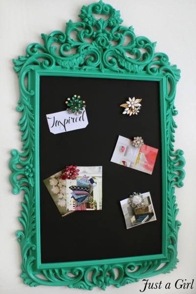
I decided to use it on something that needed a fresh color in my home. I’ve always loved this frame that I’ve used as a magnet board, but the color wasn’t working in the room anymore. It kind of yearns for a pop of color, so Pantone’s emerald was exactly what it needed.
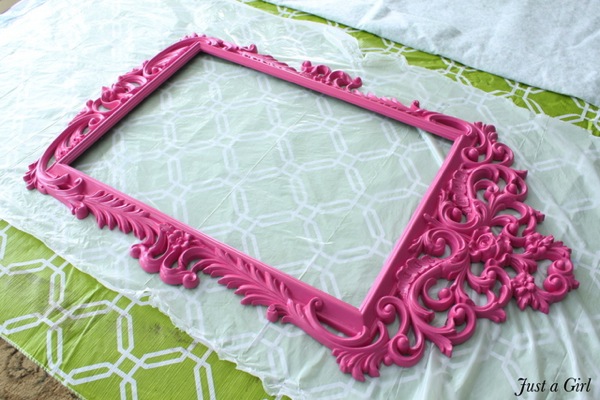
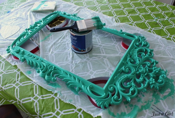
It’s a pretty detailed piece, so I used a thick brush to really get into the grooves. The color change is dramatic which is exactly what I was hoping for!
I replaced the black-painted sheet metal (also from Lowe’s) and used my grandmother’s brooches to add some pizzazz. The frame really accents the whole piece, and it partners well with the jewelry. Love it!
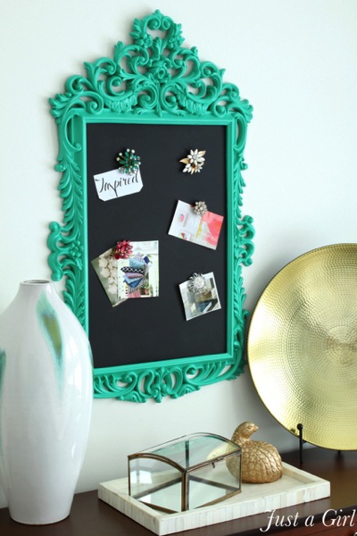
It’s a strong color, and (in my opinion) has the most impact in small doses. I placed this frame in a neutral room, and it’s a show-stopper.
Lowe’s Creative Ideas now has an awesome iPhone or iPad app to view the magazine directly. Once again, it’s completely free and full of ideas and inspiration. You’ll see some Lowe’s bloggers featured each month, so look for some familiar projects!




Where did you get that frame? Its gorgeous!
It’s such a gorgeous color! It’s such great timing too. I’m painting my hallway table this color and was a little nervous because it’s so bold. I love it!
Love the color! I painted one of those Ikea frames for a birthday party picture prop. Ispray painted it a solid ballet pink, then went over it with an acrylic paint to accentuate the nooks and crannies, using a brush, then I wiped off the excess and let it dry. Then I finished it with a pearlized spay paint. it came out so nice. If you wanted to add some depth to your nook and crannies I would suggest black mixed with some floating medium, I think you would like it….just saying.
I loved last years color of the year (the orange), but this emerald green was just not doing it for me, especially in eyeshadow at Sephora 🙂 … HOWEVER, the way you’ve used it.. as a frame out with black actually looks decently awesome. Not sure I’d re-think using it myself, but it is pretty cool on that frame 🙂
so fun! love the brooches!
I haven’t been able to embrace the Emerald Green no matter how I’ve seen it used. But I have to tell you, that bright turquoise mirror with the brooch magnets is GORGEOUS! I have to try to replicate that! You’re fortunate to have had some brooches of your own, they are so pretty. So, guess I’ll begin to hunt a similar frame and haunt the flea markets and gift shops for some vintage brooches. Thanks for sharing your creativity!
BTW, you wouldn’t care to share the shade of turq. you used, would you?
It’s not turquoise, isn’t that the Emerald green?
I love that style and I loved the pink but the green too- i think half and hald would look coooool!
Pretty color and gorgeous frame. I’ll have to leave the same comment for you that I left for the wonderful Rhoda @ Southern Hospitality- that is not emerald green. Lowe’s needs to remix or reformulate or something.